In this week analysis poll topic is about "All the information available in our blog is that useful and easy to understanding?" The proposal of this poll is to understand what our reader need. Besides that, the result of the poll may give us the idea what should we focus on and which of the thing we should not post. At last we getting the feedback from the reader which 50% of the people are prefer our current process and another 50% of the people are not sure about that. Anyway which those participant we like to thank for the feedback and we will take note on it.
Thursday, April 7, 2011
Analysis Poll Week 10
In this week analysis poll topic is about "All the information available in our blog is that useful and easy to understanding?" The proposal of this poll is to understand what our reader need. Besides that, the result of the poll may give us the idea what should we focus on and which of the thing we should not post. At last we getting the feedback from the reader which 50% of the people are prefer our current process and another 50% of the people are not sure about that. Anyway which those participant we like to thank for the feedback and we will take note on it.
Wednesday, April 6, 2011
ADOBE ILLUSTRATOR: Some Tips and Guidelines of Typography to follow
Link us to: http://sn.im/27quy2
In website designing, typography plays an important role in the design world or even our daily life. It can determine the success and failure of a project. The best thing about Adobe Illustrator is,the graphics can be incorporated in any other programs for extra effects. Below are some of the typography features to guide the readers while creating their design.
The first features are Metric Vs Optical Kerning. Adobe Illustrator provides three kerning option such as two automatic and one manual kerning to solve the user’s task easily and effectively.
The second features are Roman Hanging Punctuation. It is specially design for the user’s to handle the problem of elegant look to a block of text to the design typography. With this features, it makes the design looks clean.
The third features are Styles Panels. It helps to keep applying the same font style to the text while designers working on a large text block. It is easy and simple.
The fourth features are Placing Type on a Path. Among the features, these technique enable designers apply text to a path, either open or closed. It makes the view of the typography totally differently compare to the previous.
The last features are Scaling Area Type Numerically. With the feature of enable to scaling of text area numerically, users can skip the problem of worrying about the problems of transforming a text.
Do you think the Adobe Illustrator guidelines useful? Please share your views with us by posting your comments.
Reference:
Internet Reference:
Inspirationfeed, Shimul Aich, ADOBE ILLUSTRATOR: Some Tips and Guidelines of Typography to follow, [Online], Retrieved 4th APRIL 2011.
URL: http://inspirationfeed.com/2011/02/adobe-illustrator-some-tips-and-guidelines-of-typography-to-follow/Tuesday, April 5, 2011
PodCast International Typography Problem
Link us to: http://sn.im/27quy5
Accents found above and below some letters are called diacritical markings.

The following languages use these accents:
• Japanese
• Arabic
• Russian
• Polish
• German
Typographers consider them as full characters rather than just add-ons to unaccented letters. They are rarely used in digital typography. Even the designers of the native language did not include them. However, today, graphic designers are trying to add diacritical markings back into their work.
The following are some of the most common international typography problems
Improper Usage – users simply put the accents anywhere on the design as they like.
Skewed Meaning - Warping lettering makes the typography looks artistic. However, Warping accent marks sometimes may change the meaning of the words.
Limited Availability – Limited accented characters in numerous popular fonts that limit the choices of designers to use the accents in their designs.
Lazy substitutions - Some designers use punctuation marks, such as apostrophes, in place of similar-looking accent marks in their designs.
Lack of Demand - Due to many graphic designers are still taking the lazy route and substituting punctuation marks for proper accent marks or may be just skipping diacritics altogether, font makers do not know there is that much demand for them.
Do you know any other international typography problems?
International Typography: Problems and solutions [Online], Retrieved 4th APRIL 2011.
URL:http://www.fuelyourcreativity.com/international-typography-problems-and-solutions/
Thursday, March 31, 2011
Analysis Poll Week 9
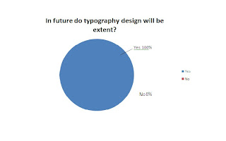
The poll question on this week is talking above "In future do typography design will be extent?"
From the Pie chart, the result of the votes from our guests is as follows
 Yes -100%-2 Votes (Blue)
No -0%-0 Votes (Red)
Cleanly from the Pie Chart, the majority votes are "Yes".
Typography is the arrangement of text on a page, and appears in some form or another in all instances of written communication. Depending on the purpose, typography can be used for maximum readability, impact, or an artistic statement. Typography is also used in newspapers, books, and other sources of information. It can also be upgraded into an art form. This can be seen in the advertising design. Other than this, typography is also used to convey an artistic statement. With all these facts, we can say the future of typography is unlimited as it will continue to be used widely. In time to come, the art of typography will become more and more advance.
Wednesday, March 30, 2011
[Video] Number of catchy typography Design Concepts
Hi guy, today i going to talk about the typography design concepts. As the previous generation, typography design was not be alert by the people it because people mind think that word will not attractive and will create boring to the audience. At the time was past, technology also become more intelligent. By using of the software creator able to produce a digital media more effective and realistic. At the mean time, a lot of the people wanna to try out a new thing and given the audience have a fresh view, to doing so some of the people design their media with the idea of combining number of word to form a piece of the art. No be curious, some of the advertisements company on now day has apply the concepts of the typography to design their advertisement. Here are the video that i have create which combining number of the famous advertisement please take a look.
Tuesday, March 29, 2011
Typography Portrait in Photoshop
Saturday, March 26, 2011
Contest Result Up to Post
HI guy. Sorry for let you all waiting our blog contest winner List positing. All of you must having a same question as me which Who will be the winner?. From the beginning of the day of our contest unit the due date, it was total of the 6 competitor in involved. Which who was totally complete the crossword puzzle that is not one that mean no winner in our contest. At the last we have decide by given way the prize by choosing who was the most completer crossword question, which is going to the competitor name Xin Dee. In the mean time we like to congratulation to to our winner and thank for all have involved. Please kept visiting our blog it may having next contest on the future and you maybe the one of the lucky person who take away the prize.


