Link us to: http://sn.im/27quy5
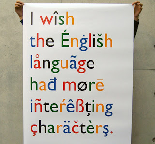
Accents found above and below some letters are called diacritical markings.

The following languages use these accents:
• Japanese
• Arabic
• Russian
• Polish
• German
Typographers consider them as full characters rather than just add-ons to unaccented letters. They are rarely used in digital typography. Even the designers of the native language did not include them. However, today, graphic designers are trying to add diacritical markings back into their work.
The following are some of the most common international typography problems
Improper Usage – users simply put the accents anywhere on the design as they like.
Skewed Meaning - Warping lettering makes the typography looks artistic. However, Warping accent marks sometimes may change the meaning of the words.
Limited Availability – Limited accented characters in numerous popular fonts that limit the choices of designers to use the accents in their designs.
Lazy substitutions - Some designers use punctuation marks, such as apostrophes, in place of similar-looking accent marks in their designs.
Lack of Demand - Due to many graphic designers are still taking the lazy route and substituting punctuation marks for proper accent marks or may be just skipping diacritics altogether, font makers do not know there is that much demand for them.
Do you know any other international typography problems?
International Typography: Problems and solutions [Online], Retrieved 4th APRIL 2011.
URL:http://www.fuelyourcreativity.com/international-typography-problems-and-solutions/

