Welcome to e-Typography. Typography Give You Another Unexpected View. Feel free to leave comments. Thank You.
e-Typography

Thursday, March 31, 2011

Analysis Poll Week 9

Link us to: http://sn.im/27quyh

The poll question on this week is talking above "In future do typography design will be extent?"

From the Pie chart, the result of the votes from our guests is as follows

Yes -100%-2 Votes (Blue)
No -0%-0 Votes (Red)

Cleanly from the Pie Chart, the majority votes are "Yes".

Typography is the arrangement of text on a page, and appears in some form or another in all instances of written communication. Depending on the purpose, typography can be used for maximum readability, impact, or an artistic statement. Typography is also used in newspapers, books, and other sources of information. It can also be upgraded into an art form. This can be seen in the advertising design. Other than this, typography is also used to convey an artistic statement. With all these facts, we can say the future of typography is unlimited as it will continue to be used widely. In time to come, the art of typography will become more and more advance.

Wednesday, March 30, 2011

[Video] Number of catchy typography Design Concepts

Link us to: http://sn.im/27quyo

Hi guy, today i going to talk about the typography design concepts. As the previous generation, typography design was not be alert by the people it because people mind think that word will not attractive and will create boring to the audience. At the time was past, technology also become more intelligent. By using of the software creator able to produce a digital media more effective and realistic. At the mean time, a lot of the people wanna to try out a new thing and given the audience have a fresh view, to doing so some of the people design their media with the idea of combining number of word to form a piece of the art. No be curious, some of the advertisements company on now day has apply the concepts of the typography to design their advertisement. Here are the video that i have create which combining number of the famous advertisement please take a look.


What do you thin about the video that i create? If you have a any subjection you may post in our comment box.

Tuesday, March 29, 2011

Typography Portrait in Photoshop

Link us to: http://sn.im/27quyp

This week, I will teach you on how to create a Typography Portrait using Adobe Photoshop. After you have followed the steps shown in the tutorial that I have provided, you will definitely feel that it is simpler than what you expected.

Step 1
At first, you need to choose the picture you want to convert and drag the picture into Photoshop. Next, you need to go to Select > Color Range.
Step 2
It will automatically prompt out a dialog box. Under the drop down menu, select Shadow and click ok.
Step 3
It will automatically select all the shadows in the picture. Next, you need to use shortcut key such as Ctrl + C to copy the picture shadow and Ctrl + J to paste the shadow into a new layer.
Step 4
Now, you need to go to Select > Color Range again, but this time you need to select Midtones under the drop down menu. Repeat the steps 3 such as Ctrl + C and Ctrl + J.
Step 5
Select the Midtones layer, go to Edit > Fill. It will automatically prompt out a dialog box. At the Contents drop down menu choose 50% Gray and at the Blending column tick Preserve Transparency.
Step 6
Select the Shadows layer, go to Edit > Fill. It will automatically prompt out a dialog box, at the Contents drop down menu choose Black and at the Blending column tick Preserve Transparency.
Step 7
Click on the Shadows layer and the Midtones layer, right click these two layers and select Merge Layers.
Step 8
Now you need a text to fill up the image, so u need to make u new document in Photoshop and you can get a text copy from anywhere else. You need to paste the text in the new document until it fills up all the document space. Next, go to Edit > Define Brush Preset and name the new brush name. Click OK button to continue.
Step 9
You will need to create 2 layers. In order to create a new layer u need to go to Layer > New > Layer. Now choose one of the new layers and use the short cut key such as Ctrl + Backspace to make the layer fill it to the white colour and hide the layer.
Step 10
Go to the Brush icon and select the new brush text that you have created just now and adjust the Capacity to 100%. Paint the text on the second new layer that you have created.
Step 11
You need to hide the second layer before continuing. Click on the Merge layer of Shadows and Midtones, by using short cut key such as Ctrl + A and Ctrl + C to copy the entire layer. Next, you need to hide the Merge layer and unhide the second new layer and click on Add Layer Mask.
Step 12
Click on the mask that you have created and paste the merge layer picture that you have just copied. Use short cut key such as Ctrl + D to deselect and Ctrl + I to invert the picture. So you will have a negative looking at the picture.
Step 13
Next, you need to unhide the first new layer and now it gives a basic outline of text graphic for you. Now, select the second new layer and click on Add a Layer Style > Gradient Overlay to apply some effect to the picture.
Step 14
It will automatically prompt out a dialog box, at the Blend Mode select Screen and at the Opacity select BlueRedYellow. Click OK Button to continue.
Step 15
To make the picture more attractive, go to Brush icon to select a soft brush and set the opacity to 30% to edit / paint over the second new layer (contain text).
Step 16
If you want to make a single word to overwrite and overwrite again, you need to create a new layer and at the Brush icon there chose the words and paste it where you want.

Step 17
You need to Right click on the second new layer to select Copy Layer Style and click on the new layer that u have just created in step 16 and Paste Layer Style to the layer. Finally, a beautiful design has been designed by me.


Do you think this tutorial helps you a lot while creating Typography portrait? Please share your views with us by posting your comments.

Reference:
Internet Reference
Psdtop blog, Typographic Portrait, [Online], Retrieved 28th MARCH 2011.


Saturday, March 26, 2011

Contest Result Up to Post

Link us to: http://sn.im/27quyr

HI guy. Sorry for let you all waiting our blog contest winner List positing. All of you must having a same question as me which Who will be the winner?. From the beginning of the day of our contest unit the due date, it was total of the 6 competitor in involved. Which who was totally complete the crossword puzzle that is not one that mean no winner in our contest. At the last we have decide by given way the prize by choosing who was the most completer crossword question, which is going to the competitor name Xin Dee. In the mean time we like to congratulation to to our winner and thank for all have involved. Please kept visiting our blog it may having next contest on the future and you maybe the one of the lucky person who take away the prize.

To show that our statement is genuine, i have attach with the print screen on the server database which hosing our contest. In the picture that is the column of the table it have 2 role that is members and result, members it show the total of the person have register and the result is show the total number of the competitor has complete the crossword puzzle.


Thursday, March 24, 2011

Analysis Poll Week 8

Link us to: http://sn.im/27or15


The poll question for this week is "What is the best font for the cover letter?". Above is a pie chart that shows the overall result of the poll. The total number of votes for this week's poll is 1 vote.

Here are the options and their respective results:

Courier - 0 % ( 0 Votes)

Times New Roman - 100% ( 1 Votes)

Bell MT - 0% ( 0 Votes)

Tahoma - 0% ( 0 Votes)

Times New Roman has 1 vote while the other option such as Courier, Bell MT and Tahoma has no vote.

Times New Roman font is a Serif Typeface. It is clear and eases the readers reading. Times New Roman is suitable to be used in drafting mails and newspaper. Besides Times New Roman, Times also a one of the variation of a theme from the Times family, its various differences developed between the versions marketed by Linotype and Monotype.

Courier fonts are not a True Type font. It is suitable to be used in programming coding. Courier has its disadvantage which is, it cannot be used in the Integrated Development Environment (IDE). Other than that, it does not look as good as it has more whitespace between lines and its words like typewritter.

Bell MT fonts is a Serif font, it will become bolder when the readers capitalize the text. This fonts is similar to Times New Roman fonts. Basically, Bell font family can be used for books, magazines and long articles.

Tahoma is a humanist Sans Serif Typeface. It is similar to Verdana fonts. Tahoma has a narrower body and tighter letter spacing. The fonts gives the bold look without having to bold the font. The font can be counted as double pixel width.

Wednesday, March 23, 2011

The due day of crossword puzzle contest

Link us to: http://sn.im/27or40

Those interested in taking part in the crossword puzzle contest must enter the contest before 12pm today. The winner of the crossword puzzle contest will be announced on 25th March 2011(Friday).

Monday, March 21, 2011

Contest Release


Guess what? Our blog contest have started by now, all of you may able to join the contest by going to the link that we provide. The whole processed of the contest will be start by visit the website http://etypocontest.dasfree.com/. Second register an account (remind all the information must be real else it will be void the one of the rule of contest). After complete the process of register the webpage will automatic guide you to the login page, just sign up and begin the contest. And further information you may either drop on the comment box or email to gino.iblog@gmail.com.

Thursday, March 17, 2011

Analysis Poll Week 7

Link us to: http://sn.im/27mxn0


Day a passing so far, is again for the time of showing the poll result. As the poll was post up on the last week is about the topic of “Do the user want our blog to provider more available free fonts to download?” with the result of the 6 total votes was vote YES, zero user going for NO and also the Other. As agree from the majority of the user was votes yes, our blog has decide to update new free fonts to download from every of the week once.

Beside that, I like to inform again our e-typography blog will going has the week contest that will be coming soon on the latest event and wish you may bring away the prize from our e-typography.

Any further information you cloud like to know, you may either can e-mail us at gino.iblog@gmail.com or post on the below comment box, we will get back to you as fast as possible that we can. 

Wednesday, March 16, 2011

Crossword Puzzle Contest

Link us to: http://sn.im/27mxqv


We as the developer of e-Typography announce that the crossword puzzle contest has begin this week as mentioned in the last post. The time you were waiting for has begin. Do you think you can complete the crossword puzzle? Hurry up and get started!!!!

All crossword puzzle questions are base on Typography and some of the clues can be obtained from our previous post. It is the time to let the readers know more about what Typography is and how Typography contributes in your daily life while participating in the contest.


Event: Typography Crossword Puzzle Contest

Contest Duration: 18th – 22th March 2011

Contest Deadline: 23th March 2011, GMT+0800, 0000

Date of Announce Winner: 23th March 2011

Prize: Mystery Gift


Winners name will be announced in our e-Typography blog post on 23th March 2011. To claim their prize, winners need to show their particular information to proof that he/she is the owner. For a complete contest terms and condition, please refer to http://e-typo.blogspot.com/2011/03/new-event-coming-soon-in-our-blog.html or http://sn.im/27e2uy.

Follow our blog for the latest information. If you have any enquires please Email us. mafia.iblog@gmail.com . All right reserved by e-Typography.


Tuesday, March 15, 2011

Common mistakes in typography

Link us to: http://sn.im/27e2wq

Users and designers need to understand the importance of good type skills and try avoiding some of the common mistakes. Below are some common mistakes used in type design/layout that can make a large impact in the effectiveness and appearance of the designs.

1. Do not distort typefaces
Some users tend to enlarge or reduce the strategically designed typefaces by stretching, squashing, etc? This takes away the legibility but also removes the purpose of why the typeface was designed the way it was.

2. Bombarded with too many typefaces
With all the free fonts out there, designers tend to use too many "less than quality" typefaces without any purposes on the design. Generally, typeface Helvetica is known for being widely versatile because of the quality of the typeface. It can be used in many of ways and under various conditions.

3. Apostrophes versus Quotation Marks
A common mistake in typography is the use of apostrophes instead of quotation marks. Many people get the two confused, using double apostrophes instead of actual quotation marks.

4. Lengthy Lines of Text

Too many long lines on a page not only making reading difficult but and also causing eye fatigue. Readers are forced to over their heads and eyes more often from one line to the next. Best to keep lines of text under 50 characters long.

5. Printing similar values of colour on top of each other

Sometimes users and designers did not the appropriate colour contrast for text and background. As above, printing a medium blue text on top of a medium brown box. This makes the design unappealing, and it makes it hard on the eyes. It also creates a muddy effect. Unlike the top one, the bottom picture has a better contrast in colour therefore making it more attractive.


References :
Common Typography Mistakes: Apostrophes Versus Quotation Marks[Online], Retrieved 15thMARCH 2011.
URL : http://webdesignledger.com/tips/common-typography-mistakes-apostrophes-versus-quotation-marks

10 Common Typography Mistakes[Online], Retrieved
15thMARCH 2011.
URL : http://www.thedesigncubicle.com/2008/12/10-common-typography-mistakes/

Thursday, March 10, 2011

Analysis Poll Week 6


The pie chart above is this week’s poll analysis on “Does typography design common use in the Malaysia advertisement strategy?”.
From the Pie chart, the result of the votes from our guests is as follows
Yes - 29% (Blue)
No - 71% (Red)
Clearly from the Pie chart, the majority votes are “No “. This may be due to a few reasons
• Staff lack of knowledge and experience in the use of typography
• Not using the modern tools or software for typography
• Still adopting the traditional strategy in preparing advertising materials
• Typography is complicated , it requires special skills and creative application.

Wednesday, March 9, 2011

New Event coming soon in our blog!!!

Link us to:  http://sn.im/27e2uy

Our blog has operate some time, in here i cloud like to take a good opportunity on saying thank for those reader and follower our blog. To show our sincerely our blog e-typo will host a contest to given you an opportunity to win an awesome prize, all the detail such as prize and how we pick a winner will be announce on come soon post because we have not yet decide until we has confine all the information. In here i like to stated down the term and condition first to given you an idea what we will be going.

Contest Term and Condition:-
1.In this Contest prize draws are open to subscribers to E-typo.blogspot.com the E-typo.blogspot.com service only who are aged 18 years or over and are resident in the Malaysia except the member of E-typo.blogspot.com, their families, agents or anyone else professionally associated with E-typo.blogspot.com.

2. It is a condition of entry that all rules are accepted as final and that the competitor agrees to abide by these rules. The decision of the judges is final and no correspondence will be entered into.

3. To enter a E-typo Contest, entrants must complete that Crossword puzzle and submit their entry via the contest web which will provide by e-typo.blogspot.com. Winners of each prize puzzle prize draw will be selected at random from all correctly completed entries received by the advertised closing date for that crossword puzzle.

4. Subscribers may enter each crossword puzzle draw once per day only.

5. Incomplete or incorrect prize puzzles will not be entered into the prize draw. Proof of transmission will not be accepted as proof of receipt. A list of the winners’ names will be published on the e-typo.blogspot.com.

6. Winners will be notified via the prize winners list on e-typo.blogspot.com Blogspot and shall receive their prizes within first weeks of publication.

7. The prizes as described are available on the dates of publication.

8. All prizes are non transferable.

9. Winners may be required to participate in publicity.

10. Events may occur that render a crossword puzzle draw itself or the awarding of a prize impossible due to reasons beyond the control of the Promoter and accordingly the Promoter may at its absolute discretion vary or amend the promotion and the entrant agrees that no liability shall attach to the Promoter as a result thereof.

Promoter: e-typo.blogspot.com

Tuesday, March 8, 2011

Typography Wallpaper in Photoshop


Link us to: http://sn.im/26mzow


This week, I will teach you few easy steps on how to create a Typography wallpaper using Adobe Photoshop. After you have followed the steps shown in the tutorial that I have provided, you might feel that it is simpler than what you expected.


Step 1
At first, you will need to create a background colour for the Typography you are going to create. I have set my background colour as black colour. Next you need to click on the Horizontal Type Tool and left click the left hand conner to right hand conner.


Step 2
You will then need to click on the set the text color to set the text colour. I have set my text colour to grey as the text description. Besides that, I also set the font size to 14pt so it looks comfortable not too big or too small
.


Step 3
I start to enter the text words that I want to. I just repeated the text by using copy and paste method until it fills the entire canvas.


Steps 4
Now, I go to Edit > Free Transform > Rotate. I set rotation to -25 degree angle. I need to stretch the box out using the text tool until it expands beyond the canvas size.


Step 5
Now I need to set the text Indicates layer visibility to hide. Next, I need to change set the text color to white and font size to 92.


Step 6
I can enter any world for my text. In this situation, I have entered e – Typography as my text. Next, I just repeated the same steps above (step 4), go to Edit > Free Transform > Rotate and rotate the text to -25 degree angle.

Step 7
In this step, I need to unhide the text that I have hided previously (step 5). Now go to the set the blending mode for the layer to set the e-Typography text as soft layer. Next, I need to click on the e-Typography text and right click choose the Duplicate Layer. Notice, I can drag and adjust the text to the suitable font and place I want to.

(Before)

(After)

Step 8
To make my Typography wallpaper to be more effective, I go to Layer> New Fill Layer> Gradient. Under the Gradient Editor choose black and white.

Step 9
After clicking ok button, it will prompt out a box called Gradient Fill. Set the Style to Radial and Scale to Reverse.


Step 10
Click on the Layer mask thumbnail, go to set the blending mode for the layer and choose soft layer. Finally, a beautiful design has been designed by me.

Do you think this tutorial helps you a lot while creating Typography wallpaper? Please share your views with us by posting your comments.

Reference:

Internet Reference:
Abduzeedo, Reader Tutorial: Typography Wallpaper in Photoshop, [Online], Retrieved 28th FEB 2011.


Thursday, March 3, 2011

Analysis Poll Week 5


All option such as Adobe Photoshop, Adobe Illustrator, Microsoft Typography have the same vote while the other option “Other” has no vote.

Adobe Photoshop can be used for creating digital images of a photographical nature or to enhance their images from a webpage, Microsoft Power Point presentation, or a document to be printed. It is a bitmap image processing and manipulation program. It is the most popular program for creating and modifying images for the web. With the improvement of Adobe Photoshop, it become most complete set of tools.

Adobe Illustrator is a professional quality art program. Its application is totally different from others from creating print to web graphics. Besides that, Adobe Illustrator is a vector based postscript drawing program. Although it can import and manipulate bitmap image, but it still retain their characteristic as vector objects. It contributes particularly with typography such as logo, brochures, menus and others.

Microsoft Typography is use to create a TrueType and OpenType formatted fonts. Nowadays, all of the Windows 7 operating system is using Microsoft Typography. The developer who wants to develop new types of fonts is recommended to use it because it is suitable for everyone.
Other software tools also available are such as Fontstruct, GNU Image Manipulation Program and others. GNU Image Manipulation Program is another tool that is similar as Adobe Photoshop. It is an open source software that give an advantages for user if they do not want to waste money to purchase.

In conclusion, it is easy to learn the basic and create designs with a professional appearance by using any type of software tools, it just having the patience to get familiar with the program. Somehow, users might be familiar with the software tools they are using now and do not want to make any changes to it or recommended by their friend.

Wednesday, March 2, 2011

Cross-platform issues: Windows -V- Apple Mac

Link us to: http://sn.im/27e2u9

Relative font sizes

Users need to be aware that type displays differently on the Macintosh (Apple Mac) and Windows operating systems. Type displayed on Window
s Web browsers will look 2 to 3 points larger than the equivalent face on the Macintosh. It is important to note that a line of 12-point Times type on a Macintosh (Apple Mac) will look more like 14 points in Times New Roman on a Windows machine.
The following table shows the major Microsoft TrueType typefaces in their 12-point sizes, as displayed in both Windows and on a Macintosh (Apple Mac).

Font faces
The basic fonts that come with Windows and the Macintosh (Apple Mac) operating system are listed below.


When specifying fonts for your Web documents, users should probably use the typefaces listed above, and should always specify at least one typeface from each operating system (for example: "Arial, Geneva") to avoid having the browser render your pages in the default font:
"Windows" fonts will have being installed on their systems for Macintosh users who have installed Microsoft Office or Microsoft's Internet Explorer Web browser. If you specify the fonts "Georgia, Times" in your font definitions, many Macintosh (Apple Mac) users will see their text set in Georgia, just as Windows users do.

Can you think of any other typography cross platform issues?


Cross-platform issues[Online], Retrieved 2ndMARCH 2011.
http://webstyleguide.com/wsg2/type/cross.html

Tuesday, March 1, 2011

Tutorial - Typography Ice Cool Effect in Photoshop

Link us to:  http://sn.im/27e2t0

In today i going to teach you all how to create a easy typography art by using the Photoshop. In this tutorial i will using the Apple Macintosh Operating system and Adobe Photoshop CS5 some of the part  may little bit different from other operating system, if you has hard time to find it on another operating system you may leave the comment i will try to figure out the problem. 

After all the step has gone through you may getting the same result as the below image.
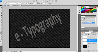
Step 1 Create a new file with 500 pixel width and 400 pixel high, with the white background.

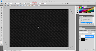
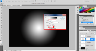
Step 2 Use Gradient Tool in the photoshop to make a background look like the above. 
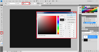
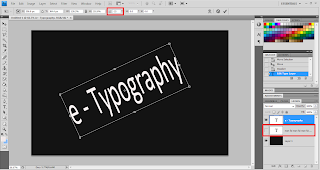
Step 3 Use Type tools to write the a world according to your wish, and set the text color to the #2bbefe
Step 4 Hold the command + Select text layer which look like above.


Step 5 go to Edit -> Copy merged, and Create a new layer, then paste in on the layer 1.
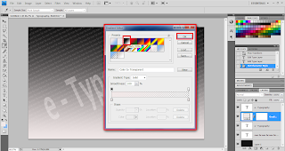
Step 6 Select the layer 1 and go to the Layer -> Layer Style -> Blending Option, set according to the image below.  


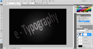
 After set up all the setting on the above, end of the result will be shown below.
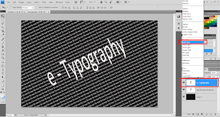
On the next step, with be same as the step 4 and 5. Hold command/CTRL + Select layer text, goto Edit -> Copy merged and paste on the new layer that will be layer 2. After that change the text color to the while by using Paint Bucket Tool. As the below will be the result after the complete. 

Step 8 Add a vector mask on the Layer 2 and use pencil Tool to erase some area in Layer 2 mask, like this. 
Step 9 Right Click -> Apply Layer Mark and use Filter -> Stylize -> Diffuse on the layer 2.


Step 10 Select the Layer 2 again and goto Edit -> Transform -> Rotate 90 CW. Then, use Filter -> Stylize -> Wind, set it as Method to Wind and Direction to From the Right.


Step 11 Rotate the back the Layer 2, to rotate back by select Edit -> Transform -> Rotate 90 CCW.


Step 12 Select the layer 2 and goto the Layer -> Layer Style -> Blending Option, set according to the image below. 


Step 13 Select the Layer 2 by hold down the Command key + Select the layer text.
Step 14 Goto Edit -> Copy Merged, Create a new Layer that is Layer 3, past on it and change it from normal to the Overlay.  


Step 15 Download the below image by click on it and paste it on your Photoshop.


Step 16 select the layer 3 change it from the Normal to the Soft Light. 


Step 17 Congratulation you has create your own typography art. 


ShareThis

back to top