
Users and designers need to understand the importance of good type skills and try avoiding some of the common mistakes. Below are some common mistakes used in type design/layout that can make a large impact in the effectiveness and appearance of the designs.
1. Do not distort typefaces
Some users tend to enlarge or reduce the strategically designed typefaces by stretching, squashing, etc? This takes away the legibility but also removes the purpose of why the typeface was designed the way it was.
2. Bombarded with too many typefaces
With all the free fonts out there, designers tend to use too many "less than quality" typefaces without any purposes on the design. Generally, typeface Helvetica is known for being widely versatile because of the quality of the typeface. It can be used in many of ways and under various conditions.
3. Apostrophes versus Quotation Marks
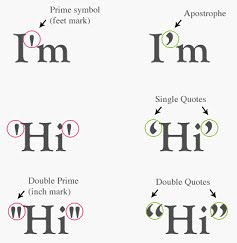 A common mistake in typography is the use of apostrophes instead of quotation marks. Many people get the two confused, using double apostrophes instead of actual quotation marks.
4. Lengthy Lines of Text
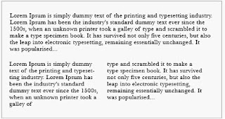
Too many long lines on a page not only making reading difficult but and also causing eye fatigue. Readers are forced to over their heads and eyes more often from one line to the next. Best to keep lines of text under 50 characters long.
5. Printing similar values of colour on top of each other
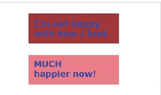
Sometimes users and designers did not the appropriate colour contrast for text and background. As above, printing a medium blue text on top of a medium brown box. This makes the design unappealing, and it makes it hard on the eyes. It also creates a muddy effect. Unlike the top one, the bottom picture has a better contrast in colour therefore making it more attractive.
References :
Common Typography Mistakes: Apostrophes Versus Quotation Marks[Online], Retrieved 15thMARCH 2011.
URL : http://webdesignledger.com/tips/common-typography-mistakes-apostrophes-versus-quotation-marks
10 Common Typography Mistakes[Online], Retrieved 15thMARCH 2011.
URL : http://www.thedesigncubicle.com/2008/12/10-common-typography-mistakes/
