In this week analysis poll topic is about "All the information available in our blog is that useful and easy to understanding?" The proposal of this poll is to understand what our reader need. Besides that, the result of the poll may give us the idea what should we focus on and which of the thing we should not post. At last we getting the feedback from the reader which 50% of the people are prefer our current process and another 50% of the people are not sure about that. Anyway which those participant we like to thank for the feedback and we will take note on it.
Thursday, April 7, 2011
Analysis Poll Week 10
In this week analysis poll topic is about "All the information available in our blog is that useful and easy to understanding?" The proposal of this poll is to understand what our reader need. Besides that, the result of the poll may give us the idea what should we focus on and which of the thing we should not post. At last we getting the feedback from the reader which 50% of the people are prefer our current process and another 50% of the people are not sure about that. Anyway which those participant we like to thank for the feedback and we will take note on it.
Wednesday, April 6, 2011
ADOBE ILLUSTRATOR: Some Tips and Guidelines of Typography to follow
Link us to: http://sn.im/27quy2
In website designing, typography plays an important role in the design world or even our daily life. It can determine the success and failure of a project. The best thing about Adobe Illustrator is,the graphics can be incorporated in any other programs for extra effects. Below are some of the typography features to guide the readers while creating their design.
The first features are Metric Vs Optical Kerning. Adobe Illustrator provides three kerning option such as two automatic and one manual kerning to solve the user’s task easily and effectively.
The second features are Roman Hanging Punctuation. It is specially design for the user’s to handle the problem of elegant look to a block of text to the design typography. With this features, it makes the design looks clean.
The third features are Styles Panels. It helps to keep applying the same font style to the text while designers working on a large text block. It is easy and simple.
The fourth features are Placing Type on a Path. Among the features, these technique enable designers apply text to a path, either open or closed. It makes the view of the typography totally differently compare to the previous.
The last features are Scaling Area Type Numerically. With the feature of enable to scaling of text area numerically, users can skip the problem of worrying about the problems of transforming a text.
Do you think the Adobe Illustrator guidelines useful? Please share your views with us by posting your comments.
Reference:
Internet Reference:
Inspirationfeed, Shimul Aich, ADOBE ILLUSTRATOR: Some Tips and Guidelines of Typography to follow, [Online], Retrieved 4th APRIL 2011.
URL: http://inspirationfeed.com/2011/02/adobe-illustrator-some-tips-and-guidelines-of-typography-to-follow/Tuesday, April 5, 2011
PodCast International Typography Problem
Link us to: http://sn.im/27quy5
Accents found above and below some letters are called diacritical markings.
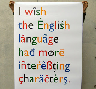
The following languages use these accents:
• Japanese
• Arabic
• Russian
• Polish
• German
Typographers consider them as full characters rather than just add-ons to unaccented letters. They are rarely used in digital typography. Even the designers of the native language did not include them. However, today, graphic designers are trying to add diacritical markings back into their work.
The following are some of the most common international typography problems
Improper Usage – users simply put the accents anywhere on the design as they like.
Skewed Meaning - Warping lettering makes the typography looks artistic. However, Warping accent marks sometimes may change the meaning of the words.
Limited Availability – Limited accented characters in numerous popular fonts that limit the choices of designers to use the accents in their designs.
Lazy substitutions - Some designers use punctuation marks, such as apostrophes, in place of similar-looking accent marks in their designs.
Lack of Demand - Due to many graphic designers are still taking the lazy route and substituting punctuation marks for proper accent marks or may be just skipping diacritics altogether, font makers do not know there is that much demand for them.
Do you know any other international typography problems?
International Typography: Problems and solutions [Online], Retrieved 4th APRIL 2011.
URL:http://www.fuelyourcreativity.com/international-typography-problems-and-solutions/
Thursday, March 31, 2011
Analysis Poll Week 9
The poll question on this week is talking above "In future do typography design will be extent?"
From the Pie chart, the result of the votes from our guests is as follows
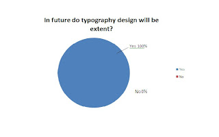 Yes -100%-2 Votes (Blue)
No -0%-0 Votes (Red)
Cleanly from the Pie Chart, the majority votes are "Yes".
Typography is the arrangement of text on a page, and appears in some form or another in all instances of written communication. Depending on the purpose, typography can be used for maximum readability, impact, or an artistic statement. Typography is also used in newspapers, books, and other sources of information. It can also be upgraded into an art form. This can be seen in the advertising design. Other than this, typography is also used to convey an artistic statement. With all these facts, we can say the future of typography is unlimited as it will continue to be used widely. In time to come, the art of typography will become more and more advance.
Wednesday, March 30, 2011
[Video] Number of catchy typography Design Concepts
Hi guy, today i going to talk about the typography design concepts. As the previous generation, typography design was not be alert by the people it because people mind think that word will not attractive and will create boring to the audience. At the time was past, technology also become more intelligent. By using of the software creator able to produce a digital media more effective and realistic. At the mean time, a lot of the people wanna to try out a new thing and given the audience have a fresh view, to doing so some of the people design their media with the idea of combining number of word to form a piece of the art. No be curious, some of the advertisements company on now day has apply the concepts of the typography to design their advertisement. Here are the video that i have create which combining number of the famous advertisement please take a look.
Tuesday, March 29, 2011
Typography Portrait in Photoshop
Saturday, March 26, 2011
Contest Result Up to Post
HI guy. Sorry for let you all waiting our blog contest winner List positing. All of you must having a same question as me which Who will be the winner?. From the beginning of the day of our contest unit the due date, it was total of the 6 competitor in involved. Which who was totally complete the crossword puzzle that is not one that mean no winner in our contest. At the last we have decide by given way the prize by choosing who was the most completer crossword question, which is going to the competitor name Xin Dee. In the mean time we like to congratulation to to our winner and thank for all have involved. Please kept visiting our blog it may having next contest on the future and you maybe the one of the lucky person who take away the prize.
Thursday, March 24, 2011
Analysis Poll Week 8
The poll question for this week is "What is the best font for the cover letter?". Above is a pie chart that shows the overall result of the poll. The total number of votes for this week's poll is 1 vote.
Here are the options and their respective results:
Courier - 0 % ( 0 Votes)
Times New Roman - 100% ( 1 Votes)
Bell MT - 0% ( 0 Votes)
Tahoma - 0% ( 0 Votes)
Times New Roman has 1 vote while the other option such as Courier, Bell MT and Tahoma has no vote.
Times New Roman font is a Serif Typeface. It is clear and eases the readers reading. Times New Roman is suitable to be used in drafting mails and newspaper. Besides Times New Roman, Times also a one of the variation of a theme from the Times family, its various differences developed between the versions marketed by Linotype and Monotype.
Courier fonts are not a True Type font. It is suitable to be used in programming coding. Courier has its disadvantage which is, it cannot be used in the Integrated Development Environment (IDE). Other than that, it does not look as good as it has more whitespace between lines and its words like typewritter.
Bell MT fonts is a Serif font, it will become bolder when the readers capitalize the text. This fonts is similar to Times New Roman fonts. Basically, Bell font family can be used for books, magazines and long articles.
Tahoma is a humanist Sans Serif Typeface. It is similar to Verdana fonts. Tahoma has a narrower body and tighter letter spacing. The fonts gives the bold look without having to bold the font. The font can be counted as double pixel width.
Wednesday, March 23, 2011
The due day of crossword puzzle contest
Those interested in taking part in the crossword puzzle contest must enter the contest before 12pm today. The winner of the crossword puzzle contest will be announced on 25th March 2011(Friday).
Tuesday, March 22, 2011
Monday, March 21, 2011
Contest Release

Guess what? Our blog contest have started by now, all of you may able to join the contest by going to the link that we provide. The whole processed of the contest will be start by visit the website http://etypocontest.dasfree.com/. Second register an account (remind all the information must be real else it will be void the one of the rule of contest). After complete the process of register the webpage will automatic guide you to the login page, just sign up and begin the contest. And further information you may either drop on the comment box or email to gino.iblog@gmail.com.
Thursday, March 17, 2011
Analysis Poll Week 7
Wednesday, March 16, 2011
Crossword Puzzle Contest
Link us to: http://sn.im/27mxqv
We as the developer of e-Typography announce that the crossword puzzle contest has begin this week as mentioned in the last post. The time you were waiting for has begin. Do you think you can complete the crossword puzzle? Hurry up and get started!!!!
All crossword puzzle questions are base on Typography and some of the clues can be obtained from our previous post. It is the time to let the readers know more about what Typography is and how Typography contributes in your daily life while participating in the contest.
Event: Typography Crossword Puzzle Contest
Contest Duration: 18th – 22th March 2011
Contest Deadline: 23th March 2011, GMT+0800, 0000
Date of Announce Winner: 23th March 2011
Prize:
Winners name will be announced in our e-Typography blog post on 23th March 2011. To claim their prize, winners need to show their particular information to proof that he/she is the owner. For a complete contest terms and condition, please refer to http://e-typo.blogspot.com/2011/03/new-event-coming-soon-in-our-blog.html or http://sn.im/27e2uy.
Follow our blog for the latest information. If you have any enquires please Email us. mafia.iblog@gmail.com . All right reserved by e-Typography.
Tuesday, March 15, 2011
Common mistakes in typography
1. Do not distort typefaces
Some users tend to enlarge or reduce the strategically designed typefaces by stretching, squashing, etc? This takes away the legibility but also removes the purpose of why the typeface was designed the way it was.
2. Bombarded with too many typefaces
With all the free fonts out there, designers tend to use too many "less than quality" typefaces without any purposes on the design. Generally, typeface Helvetica is known for being widely versatile because of the quality of the typeface. It can be used in many of ways and under various conditions.
3. Apostrophes versus Quotation Marks
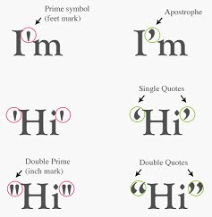 A common mistake in typography is the use of apostrophes instead of quotation marks. Many people get the two confused, using double apostrophes instead of actual quotation marks.
4. Lengthy Lines of Text
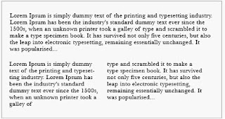
Too many long lines on a page not only making reading difficult but and also causing eye fatigue. Readers are forced to over their heads and eyes more often from one line to the next. Best to keep lines of text under 50 characters long.
5. Printing similar values of colour on top of each other
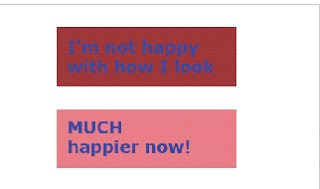
Sometimes users and designers did not the appropriate colour contrast for text and background. As above, printing a medium blue text on top of a medium brown box. This makes the design unappealing, and it makes it hard on the eyes. It also creates a muddy effect. Unlike the top one, the bottom picture has a better contrast in colour therefore making it more attractive.
References :
Common Typography Mistakes: Apostrophes Versus Quotation Marks[Online], Retrieved 15thMARCH 2011.
URL : http://webdesignledger.com/tips/common-typography-mistakes-apostrophes-versus-quotation-marks
10 Common Typography Mistakes[Online], Retrieved 15thMARCH 2011.
URL : http://www.thedesigncubicle.com/2008/12/10-common-typography-mistakes/
Thursday, March 10, 2011
Analysis Poll Week 6
The pie chart above is this week’s poll analysis on “Does typography design common use in the Malaysia advertisement strategy?”.
From the Pie chart, the result of the votes from our guests is as follows
Yes - 29% (Blue)
No - 71% (Red)
Clearly from the Pie chart, the majority votes are “No “. This may be due to a few reasons
• Staff lack of knowledge and experience in the use of typography
• Not using the modern tools or software for typography
• Still adopting the traditional strategy in preparing advertising materials
• Typography is complicated , it requires special skills and creative application.
Wednesday, March 9, 2011
New Event coming soon in our blog!!!
Our blog has operate some time, in here i cloud like to take a good opportunity on saying thank for those reader and follower our blog. To show our sincerely our blog e-typo will host a contest to given you an opportunity to win an awesome prize, all the detail such as prize and how we pick a winner will be announce on come soon post because we have not yet decide until we has confine all the information. In here i like to stated down the term and condition first to given you an idea what we will be going.
Contest Term and Condition:-
1.In this Contest prize draws are open to subscribers to E-typo.blogspot.com the E-typo.blogspot.com service only who are aged 18 years or over and are resident in the Malaysia except the member of E-typo.blogspot.com, their families, agents or anyone else professionally associated with E-typo.blogspot.com.
2. It is a condition of entry that all rules are accepted as final and that the competitor agrees to abide by these rules. The decision of the judges is final and no correspondence will be entered into.
3. To enter a E-typo Contest, entrants must complete that Crossword puzzle and submit their entry via the contest web which will provide by e-typo.blogspot.com. Winners of each prize puzzle prize draw will be selected at random from all correctly completed entries received by the advertised closing date for that crossword puzzle.
4. Subscribers may enter each crossword puzzle draw once per day only.
5. Incomplete or incorrect prize puzzles will not be entered into the prize draw. Proof of transmission will not be accepted as proof of receipt. A list of the winners’ names will be published on the e-typo.blogspot.com.
6. Winners will be notified via the prize winners list on e-typo.blogspot.com Blogspot and shall receive their prizes within first weeks of publication.
7. The prizes as described are available on the dates of publication.
8. All prizes are non transferable.
9. Winners may be required to participate in publicity.
10. Events may occur that render a crossword puzzle draw itself or the awarding of a prize impossible due to reasons beyond the control of the Promoter and accordingly the Promoter may at its absolute discretion vary or amend the promotion and the entrant agrees that no liability shall attach to the Promoter as a result thereof.
Promoter: e-typo.blogspot.com
Tuesday, March 8, 2011
Typography Wallpaper in Photoshop
Link us to: http://sn.im/26mzow
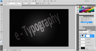
At first, you will need to create a background colour for the Typography you are going to create. I have set my background colour as black colour. Next you need to click on the Horizontal Type Tool and left click the left hand conner to right hand conner.
Step 2
You will then need to click on the set the text color to set the text colour. I have set my text colour to grey as the text description. Besides that, I also set the font size to 14pt so it looks comfortable not too big or too small.
Step 3
I start to enter the text words that I want to. I just repeated the text by using copy and paste method until it fills the entire canvas.
Steps 4
Now, I go to Edit > Free Transform > Rotate. I set rotation to -25 degree angle. I need to stretch the box out using the text tool until it expands beyond the canvas size.
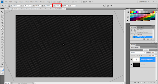
Step 5
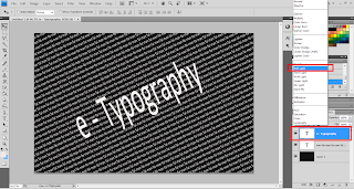
Now I need to set the text Indicates layer visibility to hide. Next, I need to change set the text color to white and font size to 92.
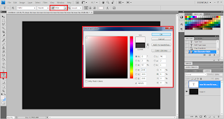
I can enter any world for my text. In this situation, I have entered e – Typography as my text. Next, I just repeated the same steps above (step 4), go to Edit > Free Transform > Rotate and rotate the text to -25 degree angle.
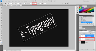
In this step, I need to unhide the text that I have hided previously (step 5). Now go to the set the blending mode for the layer to set the e-Typography text as soft layer. Next, I need to click on the e-Typography text and right click choose the Duplicate Layer. Notice, I can drag and adjust the text to the suitable font and place I want to.
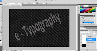
To make my Typography wallpaper to be more effective, I go to Layer> New Fill Layer> Gradient. Under the Gradient Editor choose black and white.
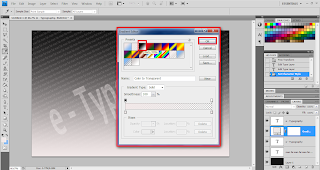
Step 9
After clicking ok button, it will prompt out a box called Gradient Fill. Set the Style to Radial and Scale to Reverse.
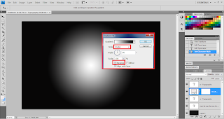
Step 10
Click on the Layer mask thumbnail, go to set the blending mode for the layer and choose soft layer. Finally, a beautiful design has been designed by me.
Reference:
Internet Reference:
Abduzeedo, Reader Tutorial: Typography Wallpaper in Photoshop, [Online], Retrieved 28th FEB 2011.


